


Ideas
- Category Name
- Ideas
Get an approximate budget for your kitchen design by sharing your space details.
Kitchen Budget Calculator


Design Ideas


Services


Decor


Magazine


More
Speak to our design professionals
Share your info, we’ll book your slot.
Get tailored made designs from our interior design services by asian paints.
Will you be living in your space during the renovation?
 Previous Question
Previous Question
Previous Question
Please Select Date and Day
Appointment Date & time


Interior and product designer Pooja Bhandary shares her take on Asian Paints’ Colour of The Year 2025, ‘Cardinal’ and its seamless application in various settings
“This shade can ground a space while allowing other design elements to shine, making it a fresh and contemporary neutral choice for Indian homes,” says Mumbai-based interior and product designer Pooja Bhandary about ‘Cardinal’, Asian Paints’ Colour of the Year 2025.
Since 2003, ColourNext by Asian Paints has been conducting in-depth colour research guided by creative powerhouses across art, architecture, interiors, fashion, sociology, media and FMCG segments. In 2025, the colour ‘Cardinal’ takes the lead. The dusky shade evokes myriad emotions, serving as a reminder to be unapologetically authentic.
Bhandary has created four looks—Elevator, Lacquer Wall, Library and Outdoor— to reflect the richness and versatility of this shade.
Every year, ColourNext also reveals four design directions, including palettes for colours, materials, finishes, and textures. Inspired by social and cultural influences from our region, these ideas are meant as a catalyst for the country's design and architecture communities to experiment.
For Bhandary, styling sets based on the 2025 ColourNext stories–Salt, India Everywhere, Feel More and Bad Taste? —was a “challenging yet fun exercise”.
Beautiful Homes speaks to the designer to deconstruct her creative process, highlighting how she adapted Cardinal, the 2025 Colour of The Year.
Pooja Bhandary (PB): When I think of the colour ‘Cardinal’, I am transported to the richness of medieval Europe. It evokes the opulence of crimson robes worn by cardinals of the Catholic Church, symbolising power, sophistication, and timeless beauty. It also reminds me of the meticulously manicured European gardens—where bold colours harmoniously blend with nature.
When I first saw this shade, it felt like a modern reinterpretation of that classic elegance—perfectly balancing boldness with subtlety. It is commanding yet inviting.
PB: This colour is adaptable across various settings. In living rooms, it offers a warm and inviting atmosphere, creating a cosy yet elegant space. In bedrooms, it adds a sense of calm and sophistication, making it a perfect backdrop for relaxation. For outdoor spaces, as seen in one of my sets, it brings a unique vibrancy without being overpowering, blending effortlessly with natural elements.
Its biggest advantage is its ability to shift in tone depending on the lighting and surrounding décor—appearing playful in bright light and sophisticated in dimmer settings. It serves as both a statement and a complement, making it ideal for homes.
PB: In Indian homes, where rich textures, patterns, and diverse design elements often co-exist, this colour serves as an unexpected yet perfect neutral. Unlike traditional neutrals like beige or grey, this hue adds character without overwhelming the space. It pairs beautifully with natural wood, metallic accents, and even bold colours like mustard or deep green, as seen in my set designs. Its earthy undertone makes it blend seamlessly with Indian decor elements like handwoven textiles, brass artefacts and traditional prints, while also offering a modern touch.
PB: My vision for the sets was to showcase the versatility of this colour across different environments—both indoor and outdoor. I wanted to break the stereotype of such a colour being limited to children’s rooms and instead wanted to present it in mature, chic settings.
I aimed for a minimalist aesthetic with a focus on clean lines and simple décor, allowing the colour to take centre stage. The classic architecture and subtle accents created a sophisticated yet understated look.
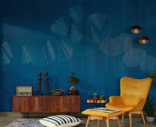
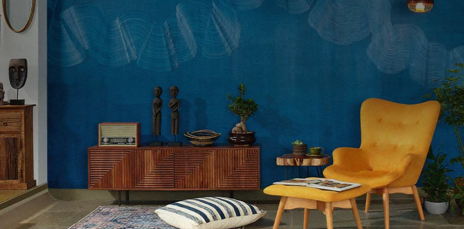
Inspired by mid-century modern design, this space was a blend of bold furniture pieces and vintage decor. The colour in a glossy finish acted as a unifying backdrop, enhancing the eclectic mix while maintaining balance.
For the library setting, I envisioned a warm, inviting space that felt personal and lived-in. The colour added depth and warmth, making it an ideal environment for books, art, and collectibles, reflecting a well-traveled, cultured lifestyle.
I wanted to push the boundaries by creating an outdoor or communal space. Inspired by urban architecture, the textured walls and contemporary design elements showcased how this colour can transform an outdoor setting into a stylish yet functional area.
PB: While discussing the brief, we were clear that ColourNext stories like Salt, Feel More, Bad Taste?, and India Everywhere would be used extensively across mediums. The idea was to show in our spaces the textures and colours that resonate with these concepts.
All spaces styled by Pooja Bhandary; Photographed by Kunal Daswani with Asian Paints

Will you be living in your space during the renovation ?
DEC 2023
Please Select Date and Day
Appointment Date & time
17 Oct 23, 03.00PM - 04.00PM