Ideas
- Category Name
- Ideas
Want a personalized
Speak to our design professionals
Share your info, we’ll book your slot.
Will you be living in your space during the renovation?
Please Select Date and Day
Appointment Date & time

From creating signature walls to going dark in design we have the best tips and ideas for you
Picking a favourite from Queer Eye’s Fab Five is, as we all know, impossible work. Yesterday Tan changes your life with the French tuck, but today JVN drops some truth bombs on beauty being self-care, Antoni loves corgis (and avocados) and last Sunday Karamo made me reexamine my closest relationships. Truthfully, we’re a puddle of emotions every time these guys are on Netflix.
But as design nerds we have a special spot for Bobby Berk, the quintet’s interior design expert who conducts all the home makeovers on the show, making the biggest impact on the participants (or heroes, as they’re called). As we binge watched Season 4 of Queer Eye, we tried to distill Berk’s biggest decorating ideas and advice.
Now, obviously, we’re having a Bobby moment and so will you after reading these:
1. Don’t be afraid of the dark
Berk’s been playing with the dark this season, painting walls in moodier tones and installing deeper shades of wood paneling. In Episode 2, he brought in dark paneling into the living room and paired it with charcoal curtains. The kitchen got some noir touches with richly hued wood cabinets, and black kitchen appliances, while the bathroom and bedroom were similarly modified with ebony paneling. To offset all this richness, Berk made sure to include a lot of white touches and lighter colours—he kept the flooring pale, brought brightness into the kitchen through the use of a lighter backsplash, used lighter shades for the kitchen platform and installed pale wood cabinets in the bathrooms.
While using dark tones, the sexy, moody vibe that most of us are
Berk balances the dark walls by relegating those shades towards the corners of the room, and having the bedding be a pristine shade of white, which lifts and brightens the centre of the space.
While using dark tones, the sexy, moody vibe that most of us are aiming for could easily transition into dungeon living if we’re not thoughtful and strategic. For instance, an untrained design eye might veer towards dark bedding in order to stay on theme with the dark walls. Not Berk. He balances the heaviness on the walls by relegating those shades towards the corners of the room, and having the bedding be a pristine shade of white, which lifts and brightens the centre of the space.
2. Learn the fine art of balance
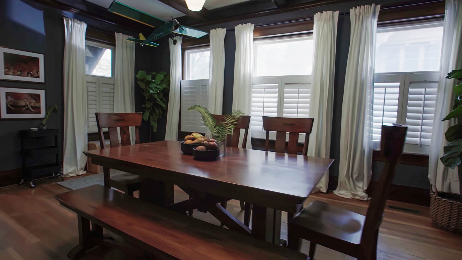
In Episode 3, Berk swaps dark panels for dark paint. He designs a den-like hunter green dining room with dark wood accents which has a moody quality that fits the home and people he’s designing for. The bedroom gets a Prussian blue makeover with light and dark wood accents and a light headboard.
When Berk goes dark, he ensures that the room has more than enough lighting. His second trick is to fill the space with an abundance of lush vegetation with potted plants in a range of sizes that are generously positioned all over the space.
When Berk goes dark, whether it be with paint or paneling, he sticks to a tried and true formula of strategically deploying other key features that bring energy and vitality. The first is lighting: his rooms tend to have an abundance of either wall or ceiling fixtures, as well as floor and table lamps. These lights can be outfitted with dimmers to either brighten and open up the space when suitable, or can be turned low when dusk-like settings are the need of the hour. His second trick is to fill the space with an abundance of lush vegetation which contributes vitality and gives the feeling of bringing the outdoors inside. Potted plants in a range of sizes are generously positioned all over the space, with tiny ones finding themselves on top of refrigerators, while monster-sized pots make corners seem vibrant and full of life.
3. Don’t stick to the shade card
Classic colours, though timeless, can get predictable. Just like our wardrobes need an infusion of trendy pieces occasionally, so do our homes. There was no better example of this than on Episode 4, when Berk painted a kitchen in—wait for it—millennial pink. It seemed like a bold, almost crazy choice, but was probably strategically made. For one, millennial pink, though trendy, has been a long-standing and established trend for a while now. While it feels new and fresh from a design perspective, Berk probably adjudged it safe enough that the home’s residents wouldn’t tire of it when the next cool colour rolls around. Secondly, since it’s a cooler, paler shade, the pink fits into the small space almost like a neutral without overwhelming it or making it seem small.
This kitchen was a triumph of quirky design: it had all the vibrant hallmarks of Palm Springs aesthetics; apart from the colour, Berk had installed a bar cart with retro lines, and there were hanging planters as well as potted plants. Even the bathroom was millennial pink and the home perfectly vibed with the homeowner, who happens to be a children’s dance instructor.
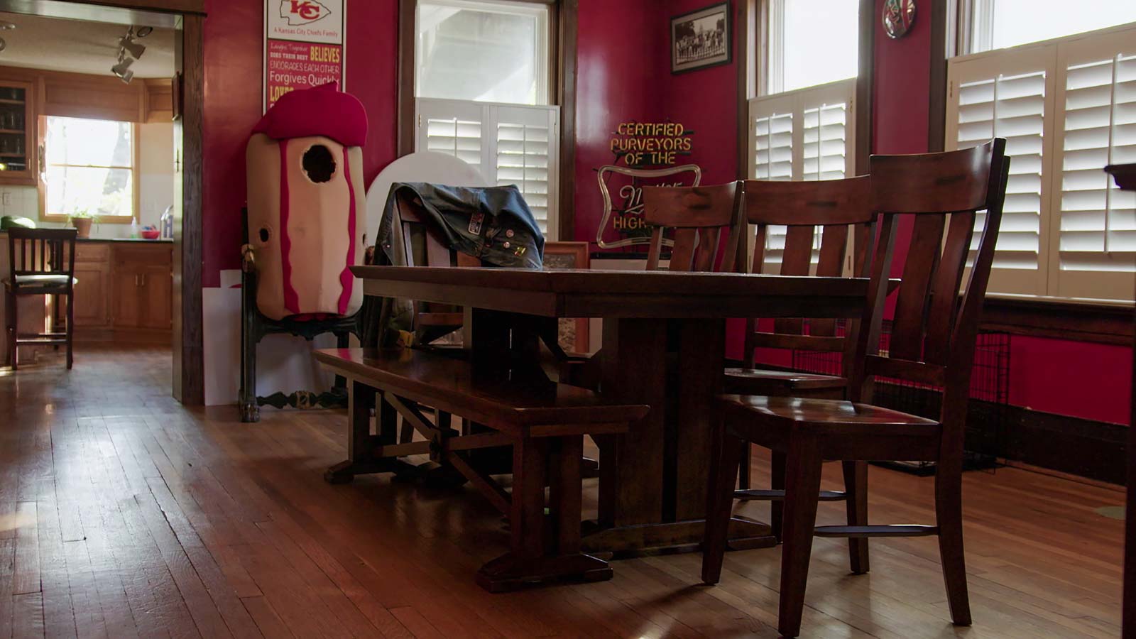
Before Berk's makeover
4. Create signature walls
Another quintessential Berk flourish this season are feature walls papered with motifs that speak directly to the resident’s esthetic or personality. On Episode 6, Berk designed a creative office space for an arts foundation, and he was free to experiment: a street artist painted a mural that honoured the founder’s passions, while the opposite wall was papered with graphic black and white stripes. In the founder’s office, he covered one wall with joyful palm leaf-printed wallpaper, placing similar tropical plants like heliconias and lilies around the room.
In Episode 8, Berk updated the kitchen of a modern farmhouse in a seriously dramatic way: two walls were clad in chunky black and white plaid squares, mirroring the resident dairy farmer’s wardrobe. This was all offset by a cherry red door that really made the kitchen pop and modernized the space while remaining true to the farmhouse esthetic.
5. Work in the woodwork
On Episode 7, Berk went to town with a variety of wood colours and textures. In one living room he managed to fit in a sand-hued driftwood side table, a walnut wood/marble mixed material coffee table and a midnight sleeper wood mantlepiece. The adjoining kitchen and dining room had dark brown cabinetry, and an island with chocolate wood paneling attached to a beach blonde wood dining table. There were similar touches in the bedroom with a beach blonde driftwood headboard and dark brown wood cabinets and drawers.
Traditional design minds would hesitate to pair even two seemingly disparate wood textures in the same room, but Berk managed to fit
a ton of them together without any of it looking awkward or discordant. The trick here is to make it seem purposeful and not accidental, by repeating patterns, textures and themes. Since the same elements are mirrored in other sections through the house, that repetition ties different rooms together and make it seem unified in design, instead of seeming like disparate hand-me-down pieces were thrown together.
6. Rethink the gallery wall
Everyone loves a gallery wall! But everyone also has a gallery wall! Do you still want a gallery wall? Berk updated the concept of grouping frames together in the most elegant way in Episode 1 by installing a shelf a few feet below the ceiling that ran along the entire length of the wall. The frames were placed on the shelf and made to lean against the wall, instead of being mounted on the wall itself. It imparted an easy, je ne sais quoi air reminiscent of chic Parisian apartments where dusty frames are stacked upright in hallways, seemingly nonchalantly overlapping each other and in random groupings. Aim for haphazard insouciance even if in truth you’ve micro-managed these picture pairings down to the last millimeter.
Will you be living in your space during the renovation ?
DEC 2023
Please Select Date and Day
Appointment Date & time
17 Oct 23, 03.00PM - 04.00PM


 Previous Question


 Previous Question

